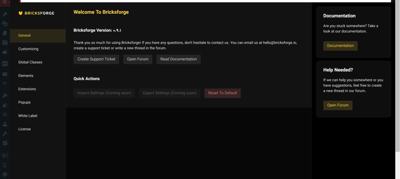
When you open Bricksforge options page (not the Bricksforge panel) it’s dimming the admin bar and the left sidebar. It’s also putting the left sidebar only with icons. Because of that my first impression was that I was opening this options page like a popup, and I was searching the “x” to close the window.
Then I realize that the admin and left bar was lighting up with mouseover and I understood that I could click to go to another part of my Wordpress. Even that was being frustrating because I only had the icons and I’m use to read, then I found myself clicking in the admin Wordpress and then going where I wanted.
Proposition:
I think that can be 3 different approach to take out this frustration.
Option 1: Don’t dim the admin bar and the left sidebar AND not force the sidebar to colapse.
Option 2: Make it a real popup and add a close element in top-right corner
Option 3: Go full with changing the Wordpress backend and not left admin bar neither left sidebar and add a button to go back to the Wordpress backend.
Personally I really prefer option 1, because it’s keeping Wordpress more consistent (something that personally it’s having more and more value).
Someone else had this frustration?
What do you thick about?
By the way, when you are in the general options you can scroll but there is nothing to scroll.
Yes, I have the same issue, when I open the bricksforge in the admin area, popup coming up، but there is no any close button. So, I have to mose over one of the admin panel bar and choose something to be able to go out of this pop up.
This UI should definitely be changed, at least we should have a close button at the top.
I don’t have the issue with the style, the issue is we can’t close it unless we open something on the left admin bar and this is annoying. It should have a close button at the top which is missing.
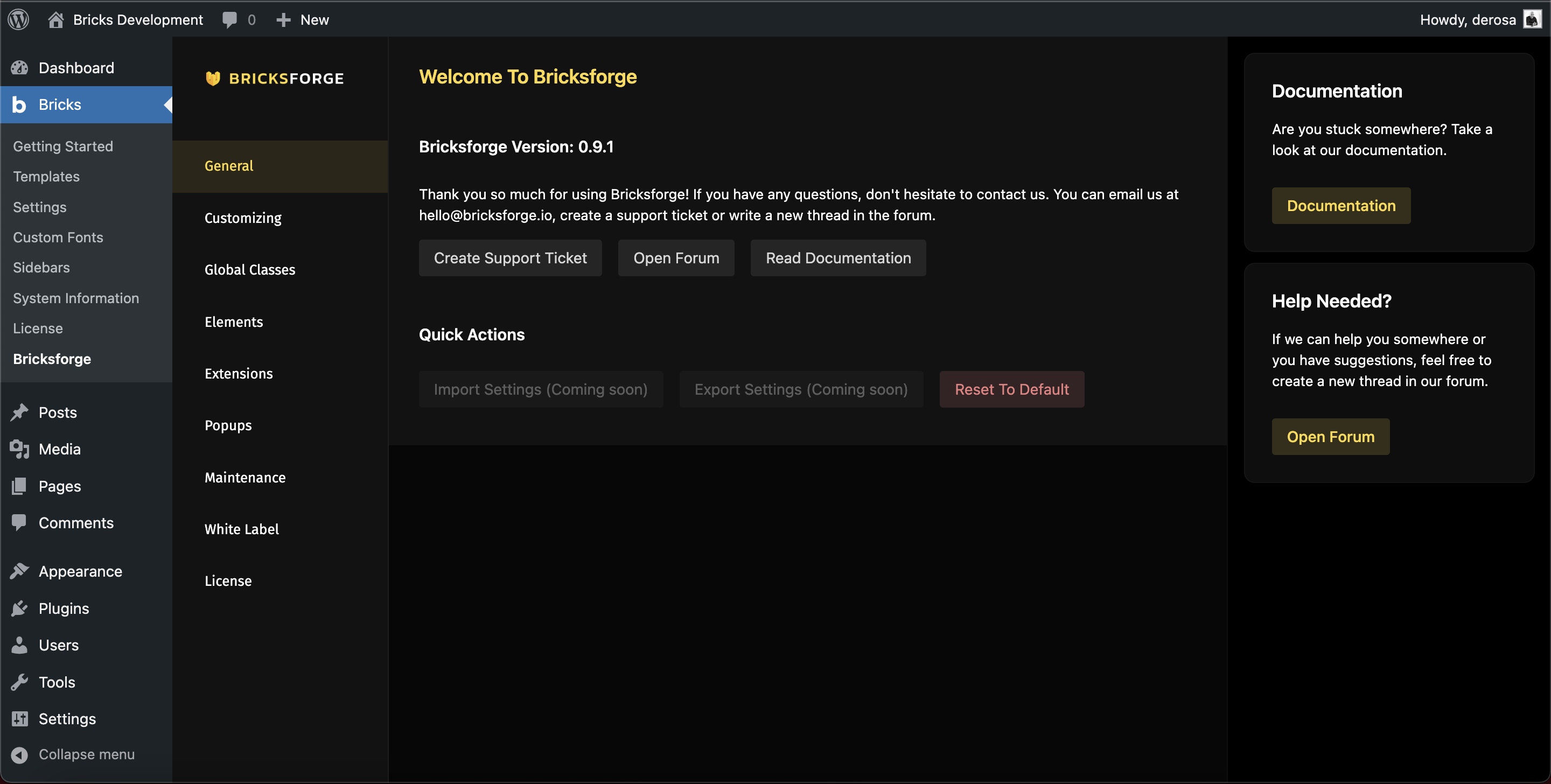
I see Daniele says it’s not a pop up, so it’s nice that the UI doesn’t cover almost the whole page. Let me take a picture to show you…
I’m not sure if you have the same UI, but for me when I open the bricksforge, I just have icons at the left. I think it doesn’t need to take almost the whole area of the admin, it shouldn’t take the left admin panel at all.
Yes, it’s not a big deal, but I personally prefer to cover just the body and doesn’t take any from the admin panel.
But it would be nice to have toggle to choose the behaviour
I discovered that was not a pop up, but I was giving you the “first-time-experience”.
For me will be nice to have this option. I think that the main option have to be the one that you share now and have one “focus mode toggle” to see it in the other way.
This is only my way to see it.
There is the weird behavior, too. There is a scroll in the general options and in other tabs when is not needing.
I was playing a little bit. I think that you could take out the min-height in .brf-options class or at least do something like;
.brf-options {
min-height: calc(100vh - 97px);
}
Like that the plugin will looks even more consistent.