About the error messages:
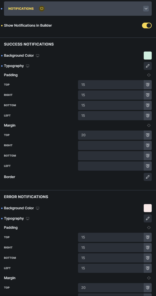
2. It took me forever to find how to style the error messages, eventually I found them under “Notifications”. I think it would be better to have their own tab for them “Error messages”, since I don’t associate error messages with notifications, what do you think?
Thanks very much for testing the MailerPress integration and for the detailed feedback!
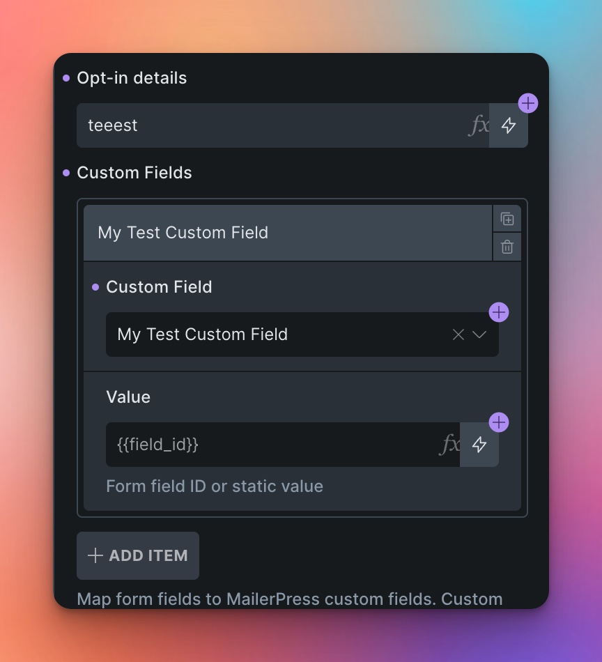
MailerPress Custom Fields:
Custom fields support is not available in the current beta version, but it has already been added. You’ll have access to it in the upcoming stable release, which I’ll be pushing out in the next few days.
You’ll find a new “Custom Fields” repeater in the MailerPress action settings where you can map form fields to your MailerPress custom fields.
Success/Error Message Location:
This structure is inherited from the native Bricks form element. We kept it this way for backwards compatibility with existing forms.
Notification Styling Location:
This was a deliberate design decision to bundle all notification-related styling in one place. While I understand the association might not be immediately obvious, having them consolidated makes it easier to maintain consistent styling across all form feedback. That said, thank you for sharing your perspective - user feedback like this is always valuable!
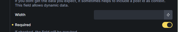
Custom Required/Validation Messages:
The default messages you’re seeing are the browser’s native validation messages. If you want to customize them, head over to the “Validation” tab, add a validation rule with type “Required”, and you can set your own custom message there.
 One question: will it be able to detect custom fields added to MailerPress?
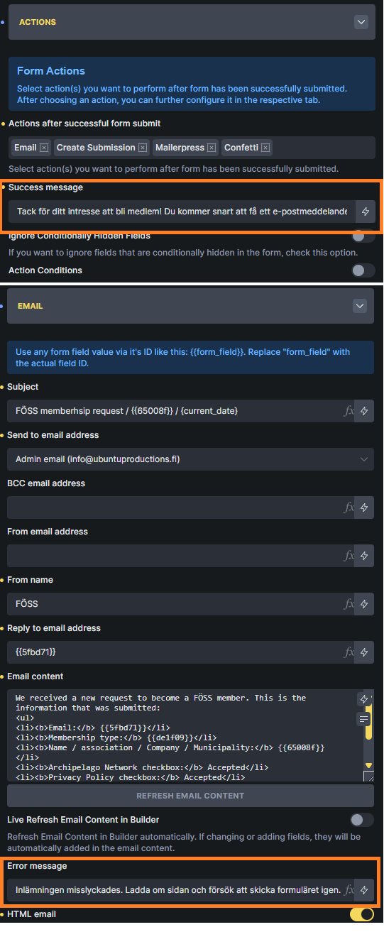