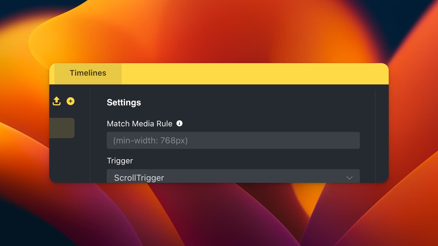
Here you can add values like CSS Media Queries. (min-width: 768px) for example will run the animation only for viewports that are larger than 768px (width).
Yes, by default, the animation will run for mobile devices the same as for desktop. Using MatchMedia, you can change this behavior. (Also regarding browser motion settings)