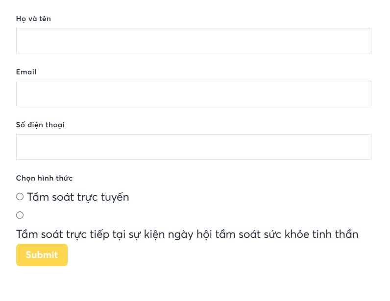
If the selection radio has too long text, the radio circle and text not in the 1 line, which cause not professional and nice UI & UX. Please fix