How to make a checkbox checked by default and style the checked state (i tried to look in the code inspector, but have not found where this blue bgcolor of the checked checkbox is set ) ?
To check it by default using JS try this:
First find the ID of your checkbox:
then add this to your pages body footer scripts:
document.addEventListener("DOMContentLoaded", function(event) {

    const defaultCheckbox = document.getElementById('your-checkbox-id');
    defaultCheckbox .checked = true;

});
As for styling, I’ve set up a base style for my sites using global classes, add the following to your global classes in BF (for checkboxes and radio buttons):
/*****RADIO BUTTONS*****/
form.styled-form-radio-simple input[type=radio] + label {
  display: flex;
  cursor: pointer;
  position: relative;
  overflow: hidden;
  margin-bottom: 5px;
}

form.styled-form-radio-simple input[type=radio] {
  position: absolute;
  left: -9999px;
}
form.styled-form-radio-simple input[type=radio]:checked + label {
  background-color: var(--primary-l-5);
}
form.styled-form-radio-simple input[type=radio]:checked + label::before {
  box-shadow: inset 0 0 0 0.4375em var(--primary);
}
form.styled-form-radio-simple input[type=radio] + label {
  display: inline-flex;
  align-items: center;
  padding: 0.375em 0.75em 0.375em 0.375em;
  border-radius: 99em;
  transition: 0.25s ease;
}
form.styled-form-radio-simple input[type=radio] + label:hover {
  background-color: var(--primary-l-5);
}
form.styled-form-radio-simple input[type=radio] + label:before {
  display: flex;
  flex-shrink: 0;
  content: "";
  background-color: #fff;
  width: 1.5em;
  height: 1.5em;
  border-radius: 50%;
  margin-right: 0.375em;
  transition: 0.25s ease;
  box-shadow: inset 0 0 0 0.125em var(--primary);
}

/*****CHECKBOXES*****/
form.styled-form-checkbox-simple input[type=checkbox] + label {
  display: flex;
  cursor: pointer;
  position: relative;
  overflow: hidden;
  margin-bottom: 5px;
}

form.styled-form-checkbox-simple input[type=checkbox] {
  position: absolute;
  left: -9999px;
}
form.styled-form-checkbox-simple input[type=checkbox]:checked + label {
  background-color: var(--primary-l-5);
}
form.styled-form-checkbox-simple input[type=checkbox]:checked + label::before {
  box-shadow: inset 0 0 0 0.4375em var(--primary);
}
form.styled-form-checkbox-simple input[type=checkbox] + label {
  display: inline-flex;
  align-items: center;
  padding: 0.375em 0.75em 0.375em 0.375em;
  border-radius: 0;
  transition: 0.25s ease;
}
form.styled-form-checkbox-simple input[type=checkbox] + label:hover {
  background-color: var(--primary-l-5);
}
form.styled-form-checkbox-simple input[type=checkbox] + label:before {
  display: flex;
  flex-shrink: 0;
  content: "";
  background-color: #fff;
  width: 1.5em;
  height: 1.5em;
  border-radius: 0;
  margin-right: 0.375em;
  transition: 0.25s ease;
  box-shadow: inset 0 0 0 0.125em var(--primary);
}

/*****INLINE RADIO BUTTONS & CHECKBOXES*****/
form.styled-form-inline-inputs ul.options-wrapper {
    display: flex;
    flex-wrap: wrap;
    align-items: flex-start;
    column-gap: 10px;
    row-gap: 10px;
}

form.styled-form-inline-inputs ul.options-wrapper li {
  margin-bottom: 0 !important;
}
- add the class
styled-form-checkbox-simpleto your form, you’ll have styled checkboxes - add the class
styled-form-radio-simpleto your form, you’ll have styled radio buttons - add the class
styled-form-inline-inputsto your form, and both your radio buttons and checkboxes will be displayed inline instead of underneath each other.
You’ll have to play around with the css and the colors to get the look you want. The styles above will make it look like this (note that all my colors are set up using css variables):
Default:
Hover:
Checked:

Thank you!
@manc provided a good code solution. But there is also an UI way to mark checkbox as checked initially.
Just pass to the Initial Value the same value as your checkbox:

Or, if you’re using the key|value syntax, pass the related key:
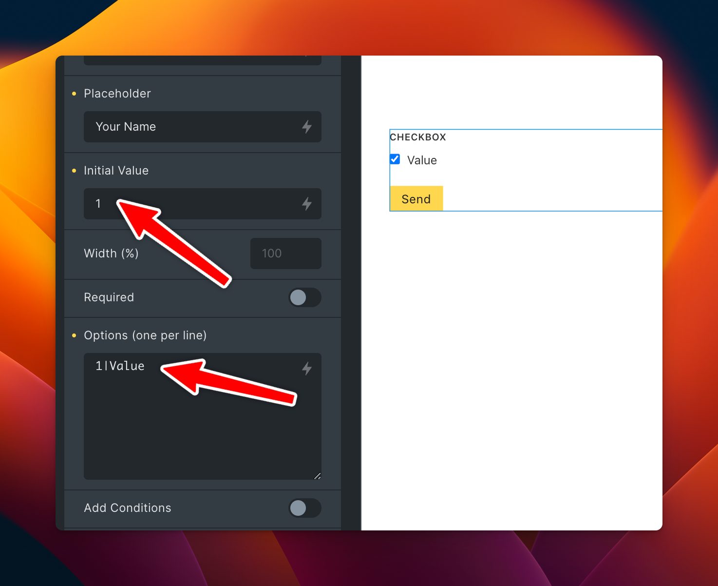
.. and your checkbox (radios as well) will be initially checked 
1 Like
whoopsie, haven’t set up a form in a while and totally forgot about that hehe
1 Like
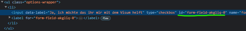
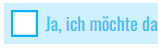
whatever I do, I cannot override this color of checkbox checked.
This color is default as far as I understand. But I don’t see where it is defined. I spent hours googling a solution, asking chat GPT, trying to adapt mang’s solution above. But nothing works… I just want to replace this blue with a button color…
Can you tell me where it is set? and how to change it??

I tried this (not working)
checkbox setup in bricks:

You already seem to have a custom design for your checkbox. I assume another plugin is responsible for that?
Anyway, with the next version you’ll be able to create checkbox / radio designs from the Pro Forms UI 
Video:
1 Like
Not really. I don’t have anything but BF ). Here I have just enlarged it with css. This blue color is initial (you can see it on your screenshot also).
Anyway, it’s a great news that it will be customisable soon.
1 Like
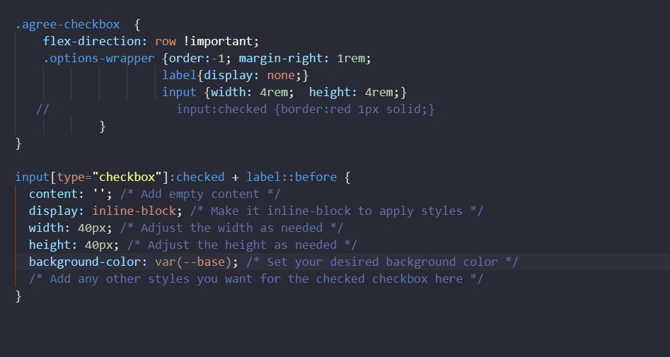
Ahh okay. So you should be able to overwrite those native checkbox background just by setting custom a background color like:
input[type="checkbox"] {
  appearance: none;
  -webkit-appearance: none;
  background-color: green;
}
…or just wait for the new update I deploy in a few days
Thank you.
1 Like