Instead of squishing the panels I would prefer a list view like behavior.
Meaning panels have a good width and overflow makes them slide in and out.
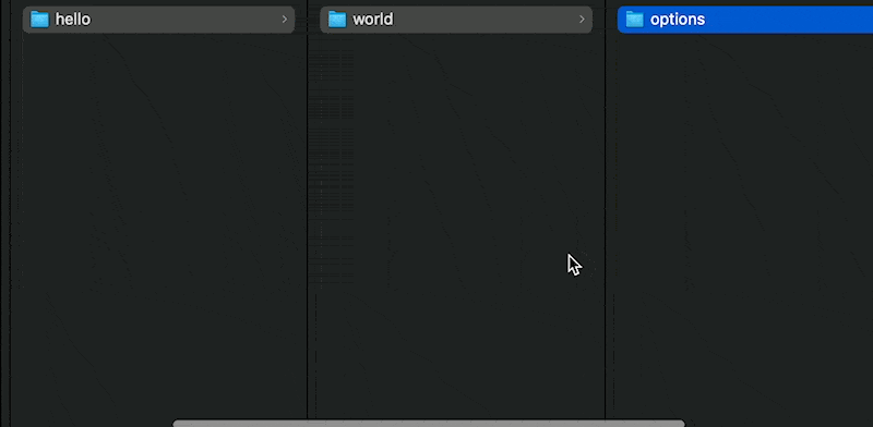
Instead of squishing the panels I would prefer a list view like behavior.
Meaning panels have a good width and overflow makes them slide in and out.
Great idea. Will add this as optional feature. I don’t know how fancy this will be for Windows. Thanks for this request ![]()
Great! Not sure what you mean with windows… just used the example from Mac Finder as it was the first thing to come to mind.
Scrollbars in native macOS applications are looking better than in Windows. Moreover, they are only displayed when scrolling. Windows always shows them, which makes it not so visually nice. (Maybe we can adjust that, though).
Ah! That makes sense … I understand.
That is so cool! Awesome!
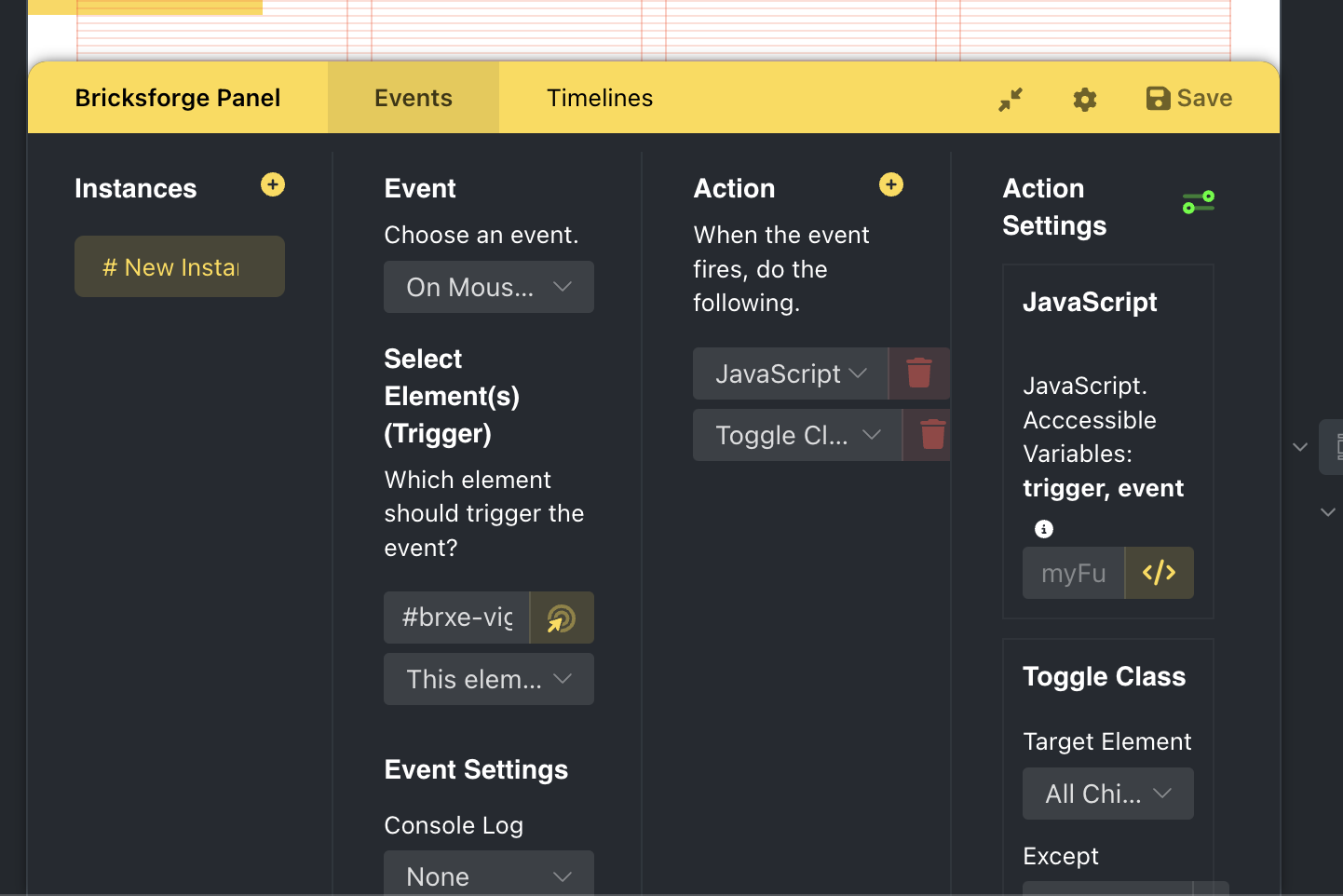
BTW Are the relative size settings also respected, couldn’t tell from the video?
Hmm… in the settings you currently can define the individual columns sizes for the grid. So I can’t consider the values, because they would only make sense if you set a fixed width for the grid container.
What would you prefer? To take the grid values into account, but to have a fixed width for the container that you can set? The higher the width, the more space your columns have, respecting your grid column values.
Or a pixel value that you can define per column? In this case all columns would have the same size. In my example it was 400px.
Maybe nothing that over complicates things. I’d just assume a hidden width value (css var) that gets multiplied by the existing column values if the volume view is activated.