Fun fact it was bricksforge that encouraged me to buy bricks itself. I was impressed with how fast you can do animation with gsap and have control over JS event.
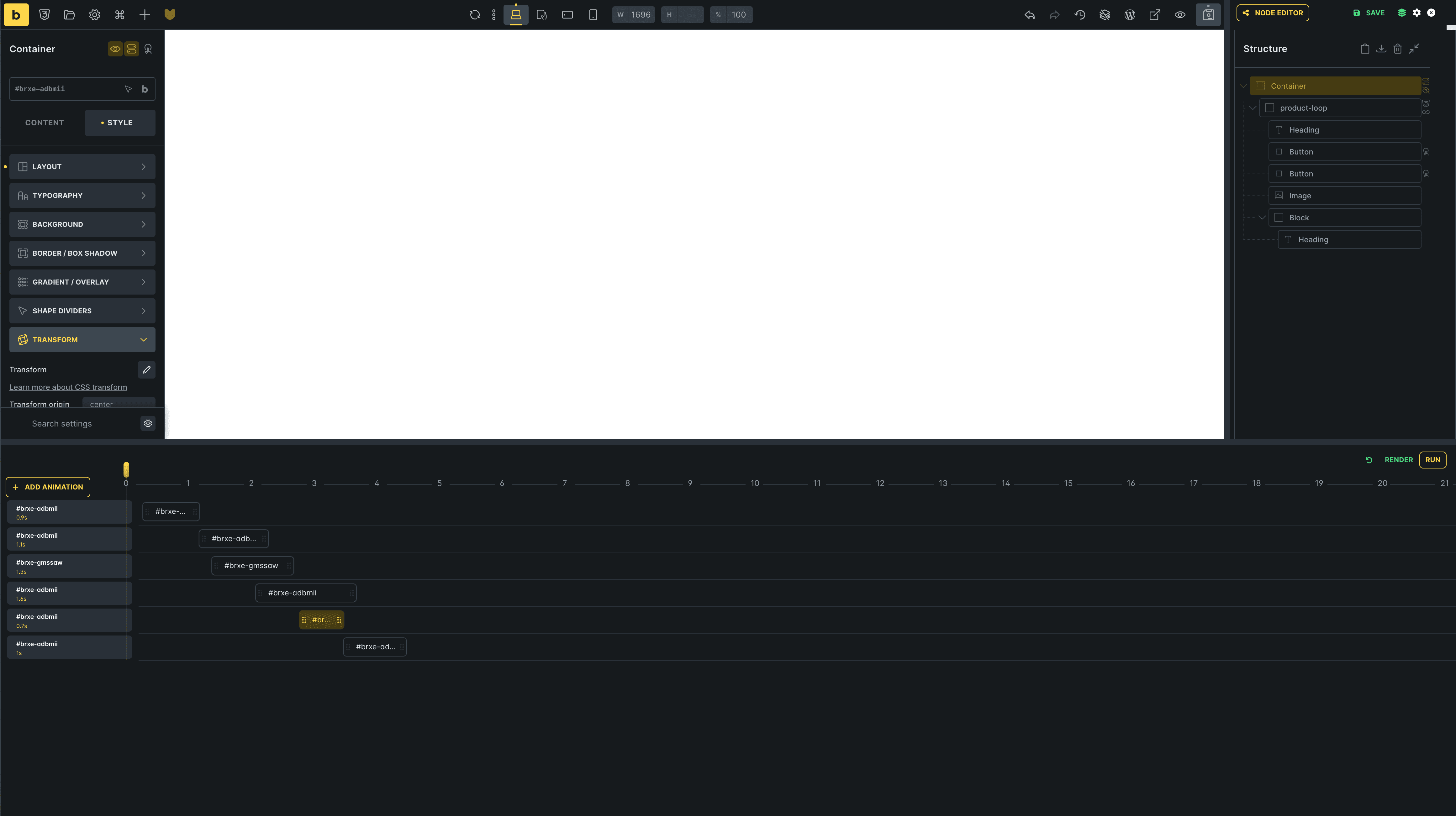
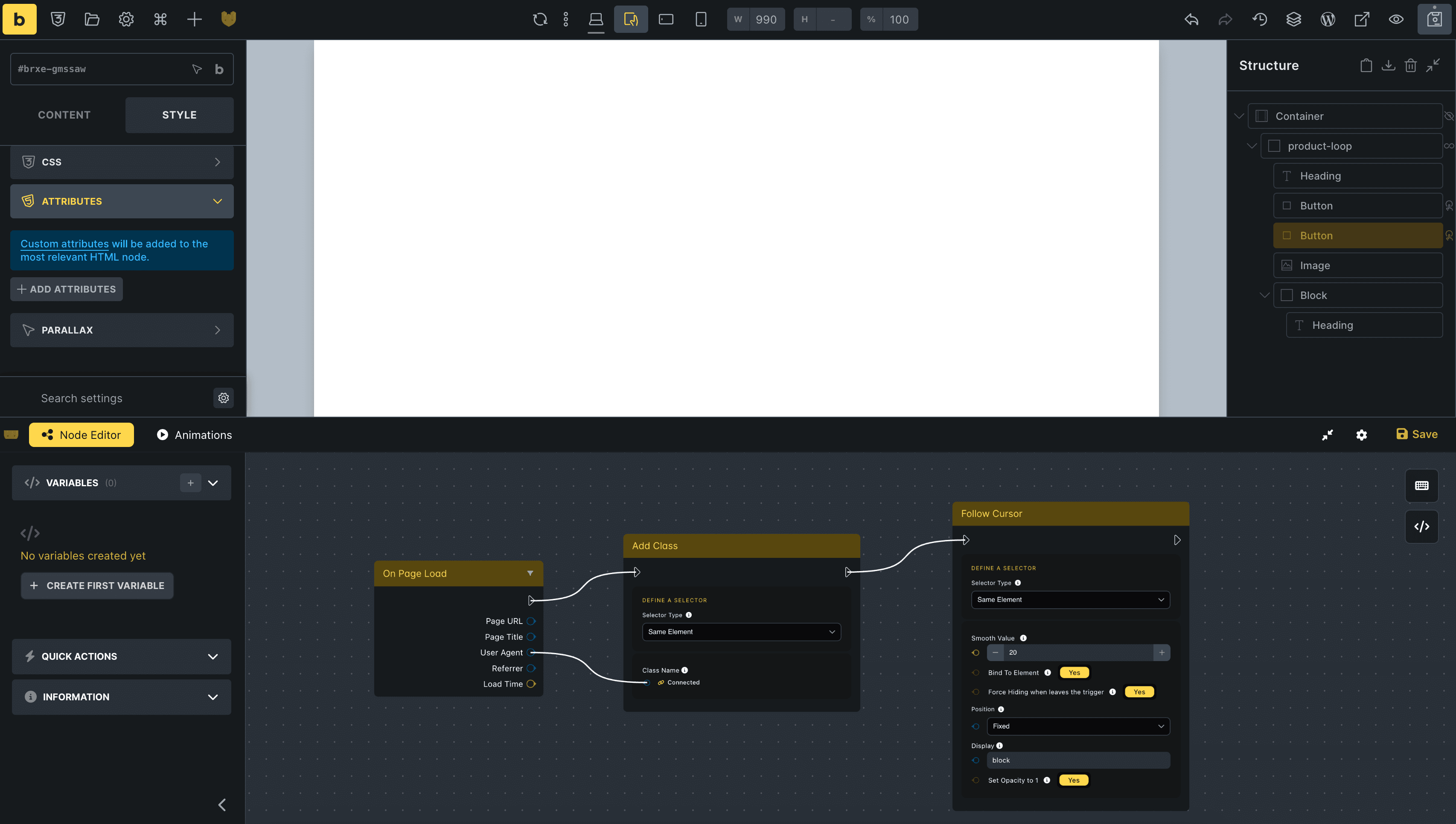
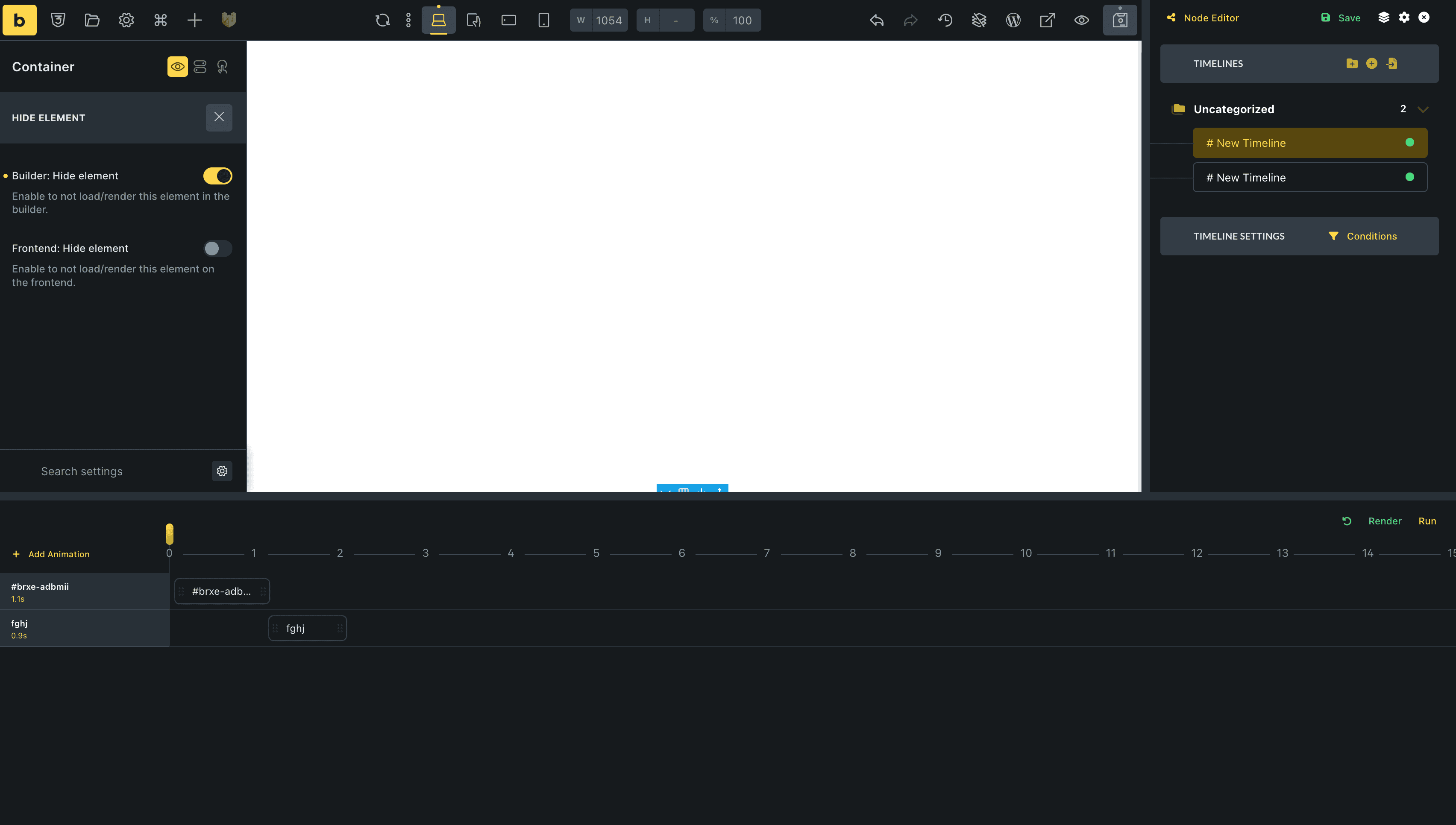
I remember the main slogan that was in hero on the still old site. that bricksforge is a tool that feels like native. and up to a certain point it was, but with the version when node editor came out (which by the way is great and powerful) the interface is like from another era ![]()
colors, gradients and shading do not match at all with what is in bricks. even more so now after the recent changes in bricks 2.0 where we have a different color palette and interface changes in general, one does not play with the other.
Maybe it would be nice to implement a color scheme based on color variables that are built into bricks? When someone wants to adjust the builder’s color scheme to suit themselves then the changes will be immediately visible in bricksforge.
see it’s just a styling tweak, and I think it looks more consistent just trying to match a few elements.
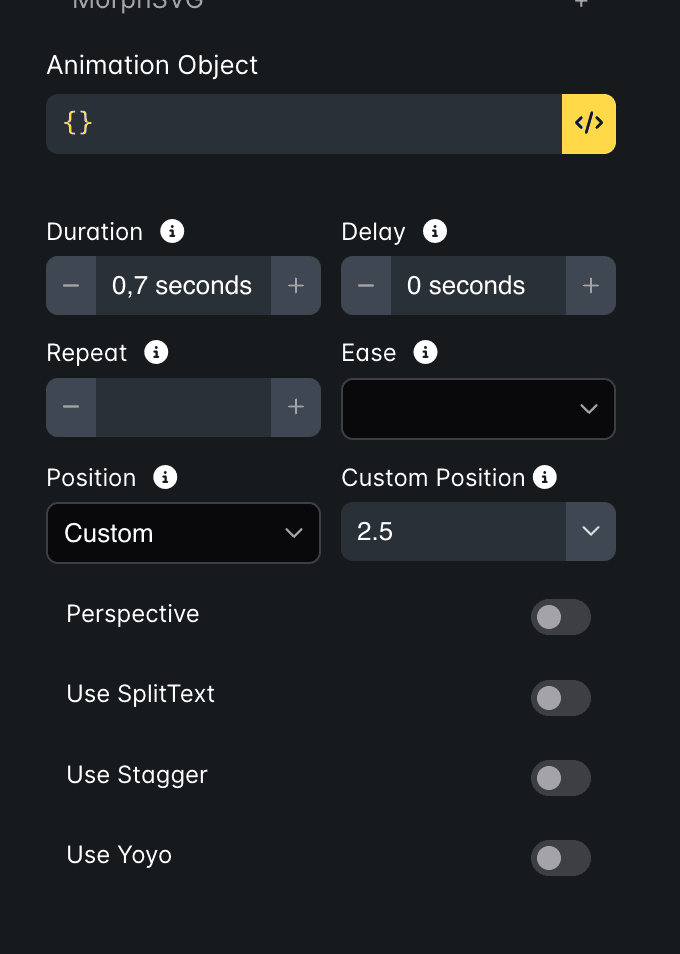
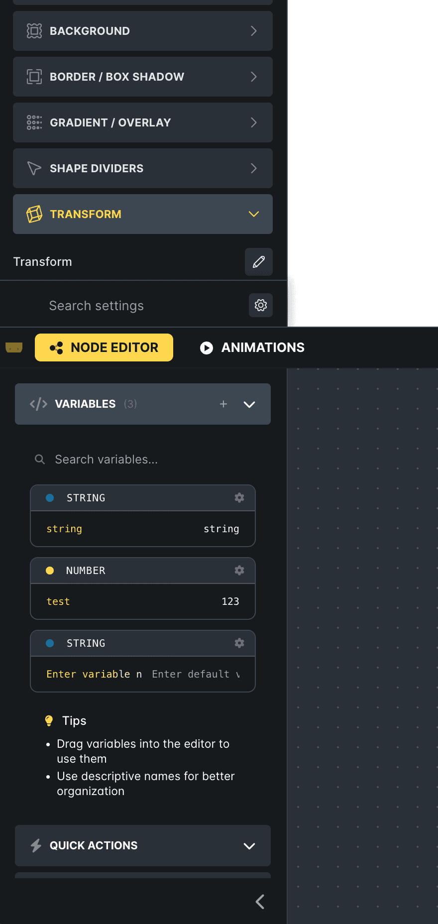
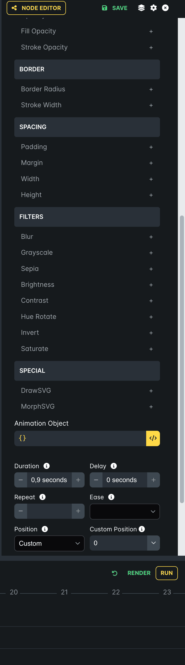
Below are some screenshots of what it might look like:
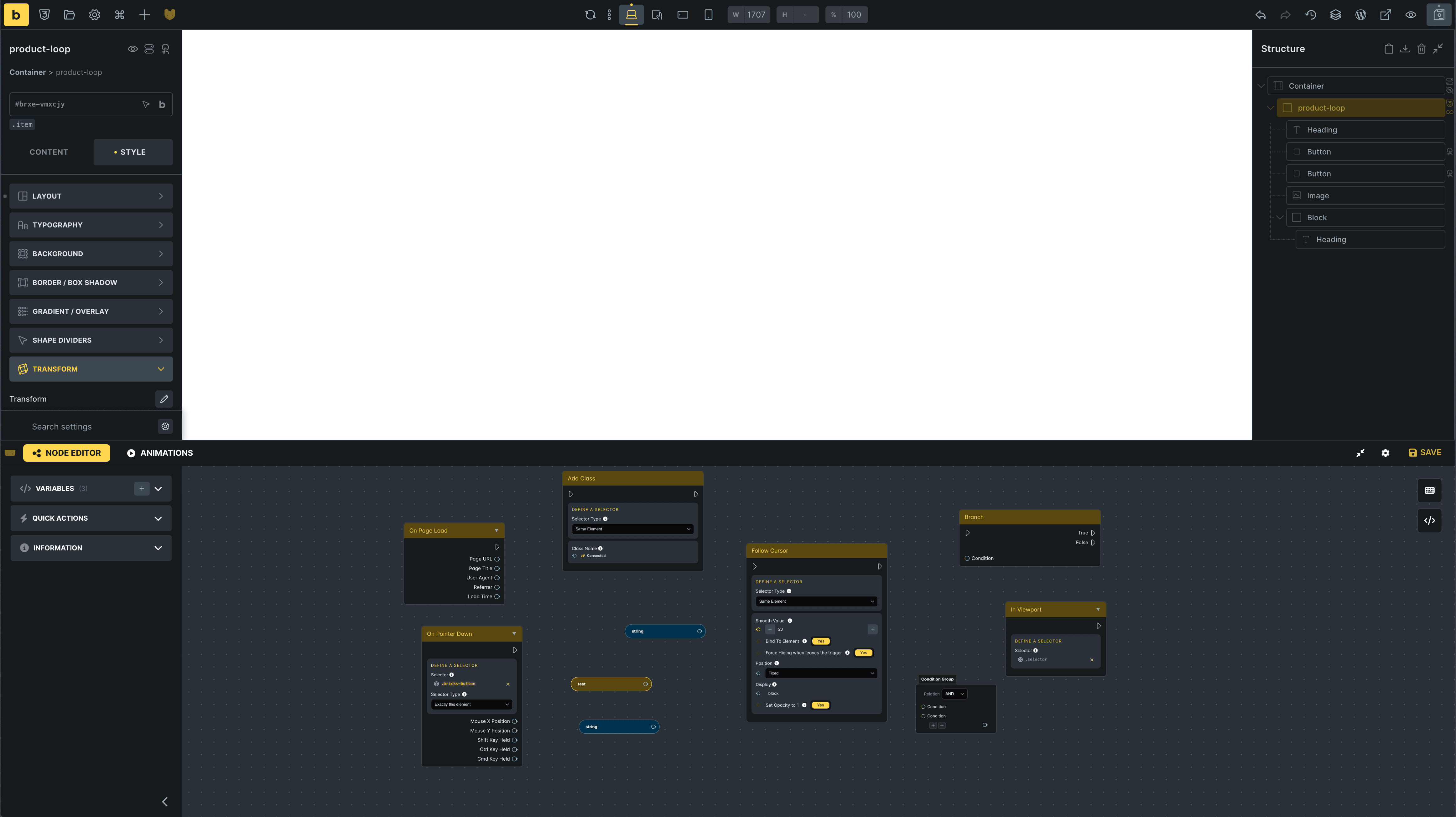
Going further with this approach, we also have toolips for additional information - they could be styled the same way as those in bricks. Many icons that are used in bricksforge can be replaced with those used by the interface in bricks.
we have trash can icons, duplicate icons, arrows and many others.
for example, with variables in node editor, there is no need to click on the gear icon to expand the duplicate or delete menu. it can be done bypassing the pinion icon, as it is with interaction or conditions elements in bricks.
e.g. resizing individual panels is different for node editor and different for animation. It would be nice if it was the same as in bricks, where by hovering over the edge∂¿ of a panel element we get a resise indicator.
In many places in the interface we have the Lato font, and it could be the nawtyny Inter that bricks uses.
There are more such small elements, but that’s just me throwing the topic!
I know that this slogan about the nativeness of bricksforge is no longer there, but it would be nice if it could be seen that this is a product tailored for bricks, not an add-on out of the blue.
Anyway great that we have bricksforge and that practical examples of tutorials on how to use the full potential of this tool are starting to appear.
I think this is worth considering, where we are about to have a ready version of bricks 2.0 and it would be great if these changes come into effect ![]() at least for me
at least for me ![]()
and it’s actually some css styling changes ![]()
what do you guys think?