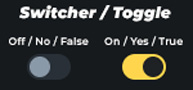
Instead of using a checkbox to represent a boolean value (true/false, 1/0, yes/no, on/off), I’d prefer to use a switch-style toggle, similar to the one used for the “Show label” setting and others.
Is there a built-in switcher component in Pro Form that I might be missing? Or is there a recommended best-practice workaround to achieve this effect?
Best,
Daniele
September 9, 2025, 6:38am
2
Natively, there isn’t such a switcher yet. However, I’ve already thought about integrating something like that.
1 Like
Hey Daniele, here’s the workaround I’ve managed to do with some additional help from AI:
/* Hide the native checkbox but keep it accessible */
%root% > input[type="checkbox"] {
  position: absolute;
  width: 1px; height: 1px;
  margin: -1px; padding: 0; border: 0;
  clip: rect(0 0 0 0);
  overflow: hidden;
}

/* Label = switch container */
%root% > input[type="checkbox"] + label {
  /* Single knob for size */
  --sw: 3.25rem;                /* change this only to scale everything */

  /* Derived values */
  --sw-h: var(--sw);            /* track height */
  --sw-w: calc(var(--sw) * 1.8);/* track width (≈1.8 × height) */
  --sw-pad: calc(var(--sw) * 0.15); /* padding = 15% of height */
  --sw-t: .21s; /* track transition duration */

  display: inline-flex;
  align-items: center;
  gap: var(--space-2xs);
  cursor: pointer;
  position: relative;
  line-height: 1.2;
  min-height: var(--sw-h);
  padding-left: calc(var(--sw-w) + var(--space-2xs)); /* space for track */
}

/* Track */
%root% > input[type="checkbox"] + label::before {
  content: "";
  position: absolute;
  left: 0;
  top: 50%;
  transform: translateY(-50%);
  width: var(--sw-w);
  height: var(--sw-h);
  background: transparent;
  border: 1px solid var(--text-primary);
  border-radius: var(--sw-h);
  transition: background var(--sw-t) ease;
}

/* Thumb */
%root% > input[type="checkbox"] + label::after {
  content: "";
  position: absolute;
  left: var(--sw-pad);
  top: 50%;
  transform: translateY(-50%);
  width: calc(var(--sw-h) - 2*var(--sw-pad));
  height: calc(var(--sw-h) - 2*var(--sw-pad));
  background: var(--text-primary);
  border-radius: 50%;
  box-shadow: 0 1px 2px rgba(0,0,0,.25);
  transition: transform var(--sw-t) ease;
}

/* Checked state */
%root% > input[type="checkbox"]:checked + label::before {
  background: var(--mimg-yellow);
}
%root% > input[type="checkbox"]:checked + label::after {
  transform: translate(calc(var(--sw-w) - var(--sw-h)), -50%);
}

/* Keyboard focus */
%root% > input[type="checkbox"]:focus-visible + label::before {
  outline: 3px solid black;
  outline-offset: 2px;
}

/* Hover effect */
%root% > input[type="checkbox"] + label:hover::before {
  filter: brightness(.95);
}

/* Disabled */
%root% > input[type="checkbox"]:disabled + label {
  opacity: .6;
  cursor: not-allowed;
}

/* Reduced motion */
@media (prefers-reduced-motion: reduce) {
  %root% > input[type="checkbox"] + label::before,
  %root% > input[type="checkbox"] + label::after {
    transition: none;
  }
}
Thanks for the solution. Would be nice when this is natively integrated in some way
1 Like