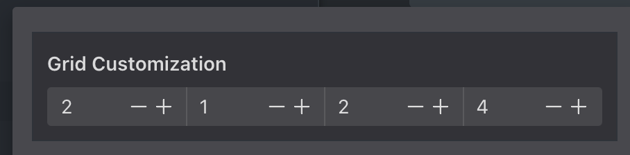
Smaller 0.5 steps would be best. If 0.5 steps don’t work maybe the current 1 is 2 and each 1 is behind the scenes (1)+{number from user} with a smaller width.
I still find that this might turn away people. … reduce the complexity here by making clear what selector this is…
Either:
“Animation Selector”
or even better (imo):
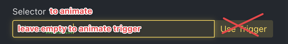
“Selector to animate”
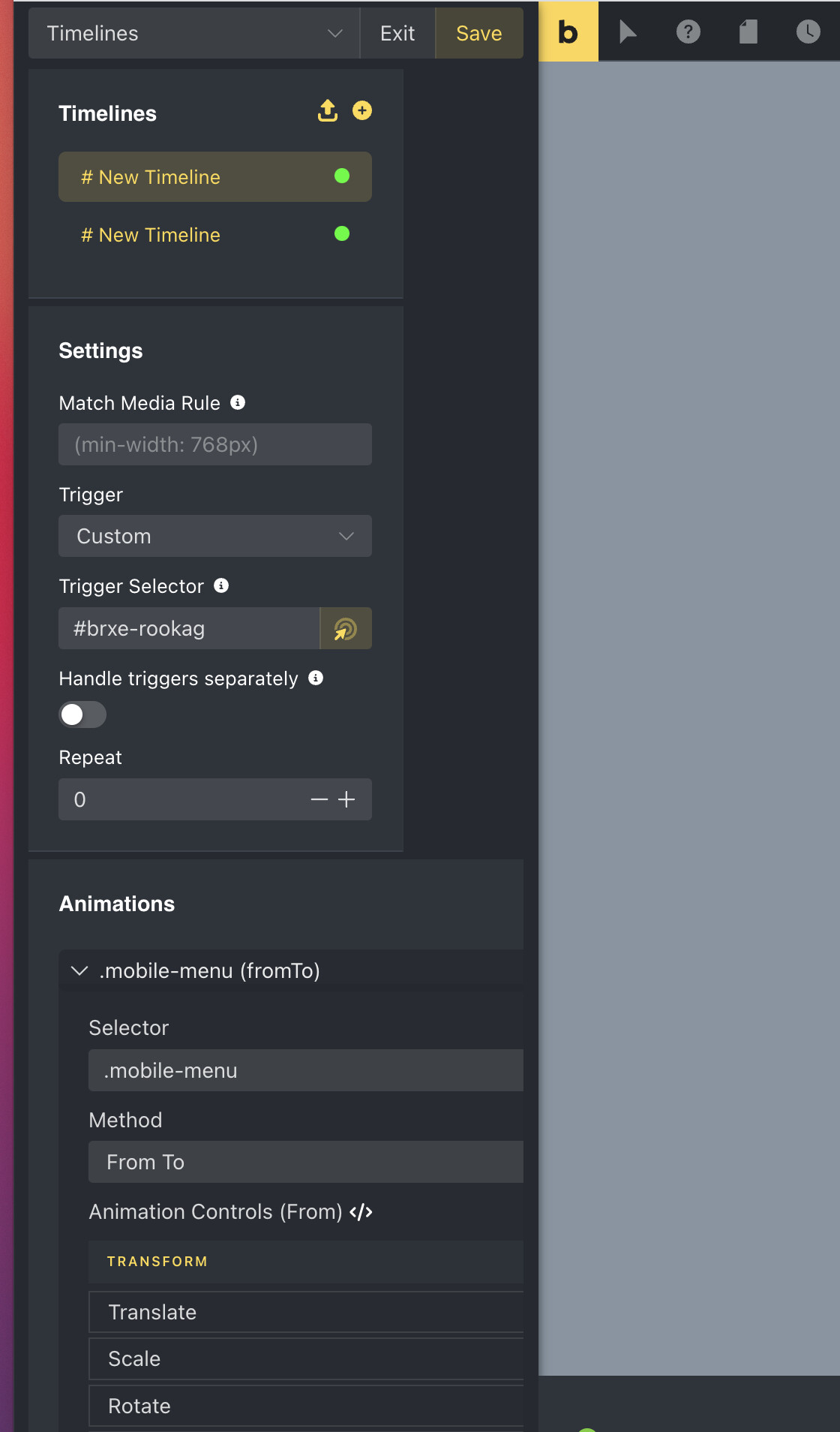
Little ⓘ is missing
Furthermore… the “use Trigger” button is confusing. I’d remove that button and have a placeholder text “Leave empty to animate trigger selector” in there. Some benefits of that approach:
If the intention is to animate the trigger, having that auto-determined if empty allows to mitigate error if the trigger selector is changed. Currently, then you would need to change it at two places
The “use Trigger” could be replaced with the selector picker button (Zielscheib mit Maus-Pointer)
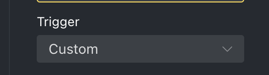
Little ⓘ is missing (explaining what the options are) + new Option:
I would add an “None” or better “Event” option that hides and resets “Trigger Selector” input entirely and explains that this will need to be triggered by an event in that case. Custom can lead to some major frustration… and really needs better explanation, hence the ⓘ
BTW the new documentation is not really hooked up to the interface. Would that make sense? or is that too much in your opinion?
On “Spacing Properties” I’d like to see height and min-height as well as width and min-width… what do you think?
Also, there is a lot of scrolling for people that only use the animation object now. Specially when using fromTo… not sure what the solution is to make pros and beginners happy at the same time.
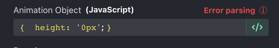
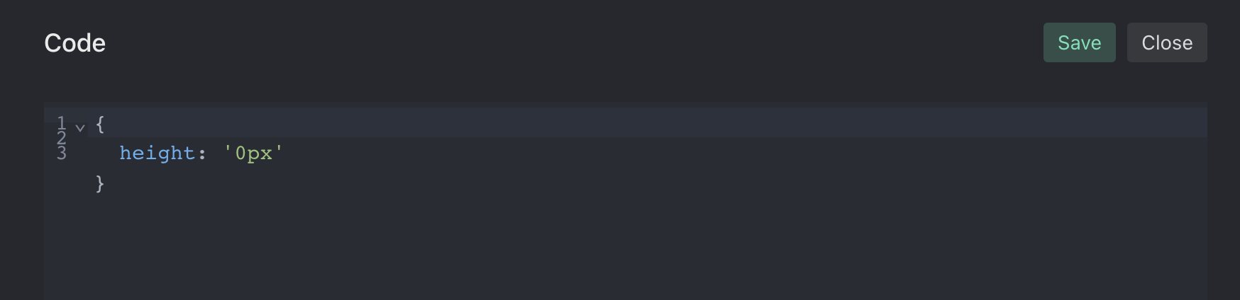
To help users while constructing an animation object manually, you could run a little function on each keystroke or is the last stroke has passed for a certain time (300ms). With a little feedback: