I’ve been facing four issues with the styling of some elements in the Pro Forms
-
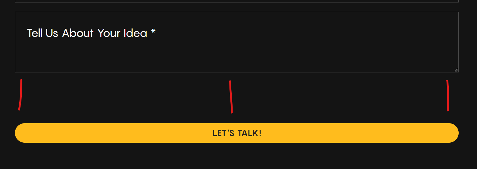
Text Area field - this takes into account the height that’s set in the field options but the text arear itself doesn’t take that into account so when you add a border, it leaves a gap below it. Essentially the height should be 100% and not auto for it work. If I change the height to 100% in dev tools on the live site, it works fine.
-
Submit button width - the submit button always takes up the full width regardless of what the flex display settings are in the container as well as the form itself. Not sure how to fix this.
-
Submit button height - although the button takes the styling from the Bricks’ theme styles, it doesn’t seem to inherit the line height of the text inside it so the button ends up looking different from the rest of the buttons on the site.
-
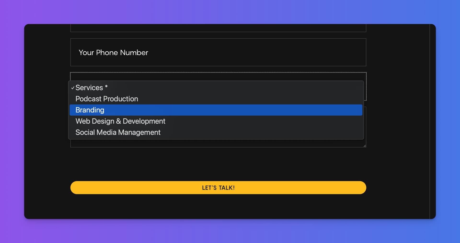
Dropdown styling - in the select filed, I can’t seem to find options to style the dropdown with the list except with custom CSS and this sometimes breaks with updates.
Refer to this page for a sample form.
Hope this helps!
For the submit button just check under the Submit button section you can style it there and assign a width and line height (Under Typography)
Thank you! That’s what I’m doing right now as a workaround but since it takes the normal button class from Bricks, it should also take all the normal button styling (and typography from the main theme styles when that is not explicitly defined in the button).
Or do I have this wrong?
Yeah I had to do some custom css to get around that because even when adding a class under the submit button section it does nothing. The bricks class style takes priority
I see. I’m hoping Daniele can shed some light on this.
Hey Daniel! I guess most of your mentioned things will be fixed with the next version I deploy today or tomorrow.
Here some side notes:
-
The different line-height is because the form is using a button tag, while the default Bricks Button is using a span tag. Changing the button element tag to button will result to the exact same style.
-
Styling the select element and its option children can be somewhat tricky because their default styling is based on the underlying operating system and browser. Are you using some plugins which are changing the default OS styling?
Hey @Daniele Thank you for this response. That’s really helpful.
-
Oh! So I should be using the button tag for everything? Good to know! I’ll do that right away. My apologies for the oversight.
-
Nope. The only plugin I have installed is Bricksforge and Bricks as the theme. Nothing else. Not sure what the issue is.
For me, it uses the default OS styling. Strange 
Could it be a windows vs Mac issue @Daniele ? I’ve only tested this on Windows devices so far. I’ll try and get access to a Mac tomorrow and check.
I’m just going to use CSS for this for now.
Hey @Daniele I updated to the latest 1.0.5 and the text area still has a gap below it and the button is still full width. Any idea how I can fix that without writing CSS?
Can you send me access in a DM?